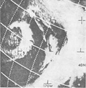
many cases this cloud may be referred to as the PVA
Max. See figure 3-1.
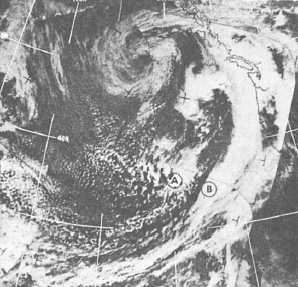
Wave or low development along an already existing
front may be detected from satellite imagery. In figure 3-
2, a secondary vorticity center is shown approaching a
frontal zone.
The cloud mass at A (fig. 3-2) is associated with a
secondary vorticity center that has moved near the
front. Interaction between this vorticity center and the
front will result in the development of another wave
near B.
By recognizing the vorticity center and determining
its movement from successive satellite passes, the
forecaster should be able to accurately predict the
formation of a second low-pressure system.
UPPER AIR CHARTS — THE FORMATION
OF NEW PRESSURE SYSTEMS
Computer drawn charts also provide the forecaster
with another tool for forecasting the development of new
pressure systems. These prognostic charts maybe used to
directly prepare a forecast, or the forecaster may use a
sequence of them to construct other charts.
A very beneficial chart used in determining changes
in surface pressure, frontogenesis, frontolysis, and
development of new pressure systems is the advection
chart. The normal methods of
Figure 3-1.-A well developed, comma-shaped cloud
is the result of a moving vorticity center to the
rear of the polar front. The comma cloud is
composed of middle and high clouds over the
lower-level cumulus and is preceded by a clear
slot.
Figure 3-2.-Frontal wave development.
construction are time-consuming; however, by using
computer charts, the chart may be more readily
constructed.
The 700-hPa, 1000-hPa, and 500-hPa thickness
charts should be used in construction of the advection
chart. The 700-hPa contours approximate the mean
wind vector between the 1000- and 500-hPa levels. On a
1000- to 500-hPa thickness chart, the contours depict
thermal wind, which blows parallel to the thickness
lines. Meteorologically speaking, we know that lines of
greater thickness represent relatively warmer air than
lines of less thickness. If the established advection
pattern is replacing higher thickness values with lower
thickness values, then it must be advecting cooler air
(convergence and divergence not considered). The
opposite of this is also true. The changing of thickness
values can be determined by the mean wind vector
within the layer of air. The 700-hPa contours will be
used as the mean wind vectors.
The advection chart should be constructed in the
following manner:
1. Place the thickness chart over the 700-mb chart
and line it up properly.
2. Remember that the 700-hPa contours represent the
mean wind vector. Place a red dot indicating warm air at
all intersections where the mean wind vector is blowing
from higher to lower thickness values.
3. Use the same procedure to place a blue dot at all
intersections where the mean wind vector is blowing
from lower to higher thickness values.
3-2


